New Spurs’ Jerseys: The Good, The Bad, The Ugly
Here are the details that you might have missed when San Antonio’s new jerseys were announced.
We are excited to bring you an in depth breakdown of the Good, the Bad, and the Ugly of the Spurs’ 2017 Nike uniforms. For purposes of this article read “The Bad” as not-so-good or questionable and “The Ugly” as the things that make me downright unhappy about the new jerseys.
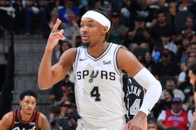
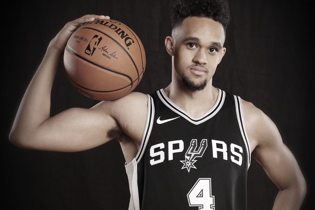
All things considered, the Spurs’ uniforms did not undergo a massive change. The look is still clean, classic, and professional but there are a few details worth exploring. Before we dive in, here is a little refresher on what the new uniforms look like, courtesy of Brandon Paul and Derrick White.
/cdn.vox-cdn.com/uploads/chorus_asset/file/9094659/Brandon_Paul_and_Derrick_White_in_Spurs_Association_Edition___Credit_Jus....jpg)
The Good:
The Fit
Athletes are picky about the way their uniform fits. I worked in football equipment for years, and every quarterback I knew liked their sleeves to fit a certain way or to have a specific amount of room in the torso. Basketball players are no different and to their credit, Nike seems to have gone above and beyond in terms of designing these jerseys with the player in mind. There isn’t a sleeve in sight (yay!) and the shorts and jersey are loose without being too baggy, which is hard to accomplish. There’s even new improvements “under the hood.” Nike added moisture-wicking technology to these new unis. In other words, they’ll soak up the sweat better. In terms of comfort and playability, these will be a hit with the players.
The Touches
If there is one thing Nike pulled off, it is the finishing touches. There are three details which jump out to me and make this uniform feel less generic and more polished.
Any chance the franchise gets to show off its 5 titles is fine with me. I love that this patch is gold now instead of the yellow the previous yerseys had.
The placement of the new logo on the shorts is also a win for me. Regardless of how you feel about the logo itself, I think it works well as an accent. The new cut of the shorts almost hearkens back to the diamond design on some of the Spurs’ classic looks.
Finally, give me those two-tone stripes on the sides all day. It’s easy to make striping too busy or flashy, which distracts from the whole jersey in the end. These uniforms have the perfect balance of incorporating a third color with the stripe, but not taking away from the feel of the entire kit.
The Bad:
Micro vs. Macro
One of my worries with the new jerseys is the lack of creativity shown across the entire league. On the micro level, the Spurs jerseys look solid and have a few nice details. But league wide (with a few exceptions) the jerseys look a little same-y or templated. My hope is that the two as-yet-unveiled alternatives for each team show a greater level of creativity and excitement than what we have seen so far.
That New Logo
By now we have all seen the new logo, with interlocking S and A in a basketball icon. I don’t think it’s awful, but it doesn’t stir up team pride within me the way the best logos do. I’m not a Bucks fan, but I become one for about 15 seconds every time I see those new icons. At its best, the emotional connection between a fan and his logo creates a feeling unlike anything else. At this point I’m willing to chart my ambivalence up to “newness”. I have to admit the logo works well as an accent on the new shorts, but I still have big questions about how it will be used in the future.
The Ugly:
Spacing
One of the biggest changes the uniforms went through is the lack of a border around our wordmark. It is undeniably a more modern, trendy design but it raises a few questions for me. The biggest of which is the impact on the spacing of the letters in “Spurs”. The lettering is too far apart and makes the whole design feel a little off. Because of the spacing issues the logo doesn’t fit well in between the letters and looks out of place. It seems like someone deleted the border around the letters in a design program, then forgot to scoot the letters closer together. I don’t hate the no-border look, but leaving that much spacing between the letters is just awkward and poor design.
Even though we ended on an Ugly note – I do like these uniforms. They have a clean design and look modern and sleek on the players. I’m pleased with Nike’s first offerings for the 2017 Spurs and hope for alternate jerseys that bring in more excitement and creativity.
What do you think of the details from the two jerseys we have seen so far? Let us know below.
Source: Pounding The Rock