Poll: Box Art Brawl: Viewtiful Joe
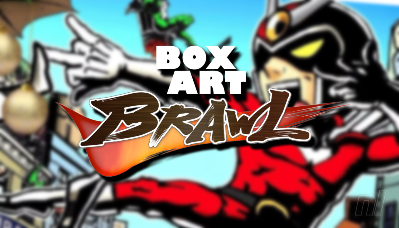
Hello folks, welcome to another edition of Box Art Brawl!
For last week’s brawl, we took a look at one of a handful of Virtual Boy games (and one that many of you had forgotten even existed): Panic Bomber. It wasn’t a particularly close race for this one, with Japan winning comfortably with 71% of the vote. Well done, Japan!
This week, we’re heading back to the GameCube era to check out one of Hideki Kamiya’s best games: Viewtiful Joe! We’ve got different cover designs across all three major regions this time, so it’s going to be a proper, three-way brawl. Nice.
Launched back in 2003, Viewtiful Joe was released exclusively for the GameCube as part of the ‘Capcom Five’; five (well, technically four) games that Capcom had pledged to create specifically for the GameCube to boost hardware sales and demonstrate strong third-party support, including the legendary Resident Evil 4. Of course, most of us know by now how this all eventually transpired: three of the four games made their way to other platforms, with only P.N.03 remaining exclusive to the GameCube.
Nevertheless, Viewtiful Joe was a critical success, even if it wasn’t particularly a commercial one. It spawned a direct sequel and a couple of spin-off games, and quite frankly, we’re just itching for Capcom to get it ported over to the Switch!
Be sure to cast your votes in the poll below; but first, let’s check out the box art designs themselves.
North America
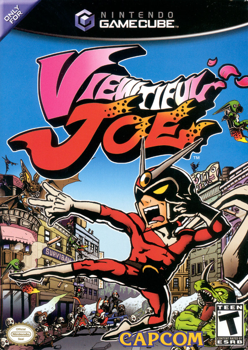
North America’s design for Viewtiful Joe is probably the most “traditional” out of all of the variants, in that it simply features the titular protagonist against a fairly busy background, full to the brim with the game’s various enemies. It’s absolutely gorgeous, bursting with colour from corner to corner, with the logo itself nice and bold at the top. Lovely!
Europe
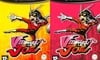
Huh? Twoooo?!
Yep. Europe got two box art variants for Viewtiful Joe, though the only difference between them is the colour: one is yellow, and the other pink – ta-da! Otherwise, we’ve got the protagonist himself striking the same pose as the North American variant, and both designs have the same background as each other. Why were there two variants? There just were! This writer remembers being lumbered with the pink one and being fairly disappointed, but looking back now..? Yeah, they’re both really nice.
Japan
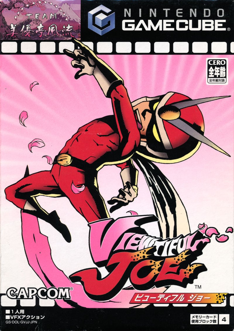
Japan’s design is quite interesting, because it’s the only one of the bunch that features the game’s signature film reel visual at the top. Our protagonist is striking a different (albeit arguably more iconic) pose from the western design, and we’ve got a really lovely pink gradiant going on with the background, including some pretty flower petals surrounding Joe. This is a great design overall!
Thanks for voting! We’ll see you next time for another round of the Box Art Brawl.