The best San Antonio Spurs jerseys
Walking down memory lane through all of the great Silver and Black unis.
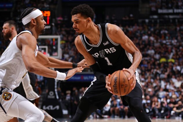
Last week the Spurs unveiled the first pair of their new uniforms. As we try to see ourselves wearing these new uniforms for the next five years, we thought it was time to take a look at the past.
What better chance to celebrate a few of the best looks the team has ever had? So, join me in raising a glass to the five best jerseys in the team’s history!
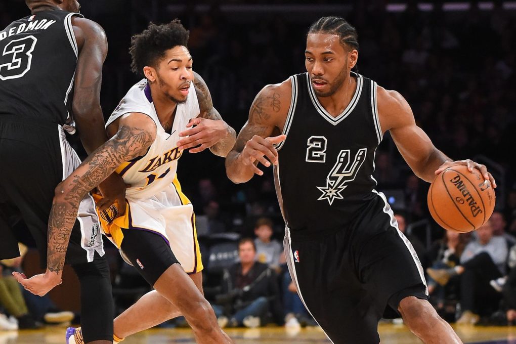
#5 : The Reinvented Spurs Look
/cdn.vox-cdn.com/uploads/chorus_asset/file/9061213/683960098.jpg)
Photo by Ezra Shaw/Getty Images
I love this jersey. It incorporates the black lettering/white outline from some of the best Spurs’ uniforms. The black background makes the logo more of a statement than the silver alternates. The silver accent on the sides makes the spur pop and rounds out the whole look. Overall, I feel like this is a lean, mean look.
It’s hard to go wrong with the classic Spurs look. What is the first uniform that comes to mind whenever you try to picture an ideal San Antonio Spur? It’s obviously not the camo jerseys, which we can all agree are difficult to look at. Instead, it’s those crisp black uniforms which seem timeless. Anybody can rock the silver and black and maintain a level of class that is unattainable with most other uniforms.
Considering the Spurs were the first to rock black uniforms, I think it’s only right that we give these uniforms the proper respect they deserve. And what better way to do that than watching Kawhi Leonard dunk on someone?
The KLAW! @KawhiLeonard‘s TOP 10 PLAYS from the 2016-17 season for the @Spurs! #BESTofNBA pic.twitter.com/j5ovZWUb8S
— NBA (@NBA) August 14, 2017
Some might say that Clint Capela had it coming anyways.
#4: 70’s Silver Saturdays Jersey
/cdn.vox-cdn.com/uploads/chorus_asset/file/9061277/dietrick_240_spurs.jpg)
Getty Images
These uniforms are iconic because of the history surrounding them. They may not be the prettiest things around, but they have a special place in my heart. In fact, my mom still remembers going to Silver Saturday games. Such a blast from the past.
The diamond design on the shorts is a classic and the bold lettering reminds me of old block numbers on football uniforms.
While these uniforms have aged considerably, they’re remembered because the history behind them was fun. It was enjoyable to watch the Saturday games when the Spurs would run up and down the court in their once-a-week uniforms.
In fact, back when Adidas was doing the uniforms during the 2006-2007 season, the Spurs celebrated a “Silver Saturday” because of their participation in a league wide even called “NBA Hardwood Classics Night.”
Oh how the times have changed. I wonder if Nike will create an all time classic jersey to give homage to Silver Saturdays.
#3: 2014 White Unis
/cdn.vox-cdn.com/uploads/chorus_asset/file/9061345/450137572.jpg)
Photo by Andy Lyons/Getty Images
If these jerseys had a nickname, it’d be “Mr. Clean: 2014” Not only does it rhyme, but it’s pithy and just a little bit profound.
In addition to the classic black jerseys, these white unis probably spring to mind whenever people think about the Spurs. It’s impossible to imagine anyone looking bad in these. The black numbers, silver outline, and two-tone stripe up the sides are all features that are done just right. These jerseys were clean and understated, yet highly professional — just like the Spurs.
#2: Late 70’s Black Jersey with Black Lettering
/cdn.vox-cdn.com/uploads/chorus_asset/file/9061527/george_gervin.jpg)
Getty Images
These jerseys were the first time the Spurs had black numbers paired with white outline on a black jersey. Mix that with “San Antonio” spelled out and the awesome diamond feature on the shorts and this is a real Spurs staple.
It’s hard to imagine the Spurs drifting far away from these uniforms. The simple black jerseys have been their bread and butter for a long time. The only major alteration that the Spurs have made to make their current unis is putting the logo on the front instead of “San Antonio.”
I guess I’m a sucker for the black lettering because that shows up a few times on this list.
#1: 2016 NBA Christmas Jersey
/cdn.vox-cdn.com/uploads/chorus_asset/file/9061601/630521630.jpg)
Photo by Ronald Cortes/Getty Images
And this is my favorite Spurs jersey. The aesthetics of this font are perfect for the holiday and easy on the eyes. The light silver lettering looks sleek against the matte black jersey. The black stripe up the side is an easy-to-miss feature that adds something subtle to the uniform.
This is a great example of a simple design that works well. Nothing on this uni is too busy or complex. It fits perfectly within the wardrobe of the rest of San Antonio’s jerseys, which isn’t always the case in the special-event uniforms. The slight deviations from the standard look work well together.
I can’t get over the number nine on Tony Parker’s back. It has the perfect curvature on the top and the swoop underneath is pleasing. I think I could stare at it for hours on end. I really enjoy this jersey and wish we could have seen it in action a few more times.
What do you think? Is there an awesome jersey out that I missed? Did I overrate something? Let us know in the comments.
Source: Pounding The Rock